
Missed the second part of this mini-blog series? Read it here.
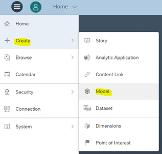
Part three of this mini-blog series will show you how to assign the output of a calculation view as a model (data source) in SAC which in-turn will form the basis of our story (dashboard).
Then click on “get data from a data source”.
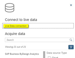
Navigate to “connect to live data” and click on “live data connection”.
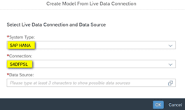
Select system type “SAP HANA” and the desired connection. In this case “S4DFPSL”. If your connection does not appear, please refer back to the first article in this mini-series “Establishing a tenant database connection in SAP Analytics Cloud“.
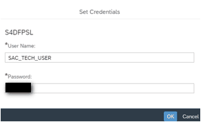
You will then be prompted to enter the password for the user for which you created the graphical calculation view in HANA Studio/Web IDE.
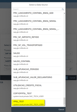
Once you have provided the login credentials, you should be able to see the calculation view created earlier in SAP HANA Studio / SAP Web IDE for SAP HANA. Once selected, click “ok”.
The output of the calculation view is now added to SAC as a data source (Model). Now we can begin configuring the model. Navigate to the tab “all dimensions”. Here you can see all the metadata of the attributes (fields) and measures (key figures) that were provided as output from the calculation view. Only the technical names are listed. To give more meaning to these attributes, you can provide a description.
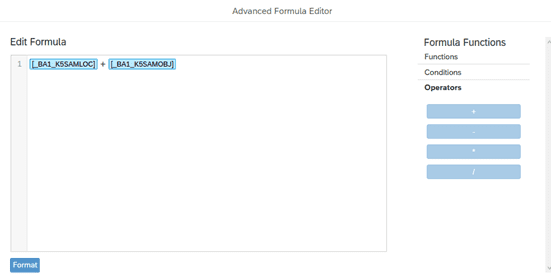
You can also create calculated columns for measures. In this example, we have created a calculated column called “CAL_COL”. We added a simple formula that sums both the key figures “_BA1_K55AMLOC” and “_BA1_K55AMOBJ”.
In the formulas tab, you can select the operators (-,+,/,*), functions such as “IF” or “LIKE” and finally conditions such as “AND,” “OR,” “>=” etc.
Once you have configured the metadata, go ahead and save the model by clicking on the icon highlighted in yellow below.
You can find the model you have just created by clicking on “browse” and selecting “files”. This opens a repository of all objects that have been created in SAC.
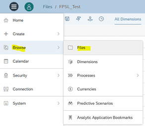

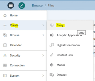
Creating a “Story” in SAC
Now that we have created our model, the next step is to create a story to analyze and visualize the data provided by the model.
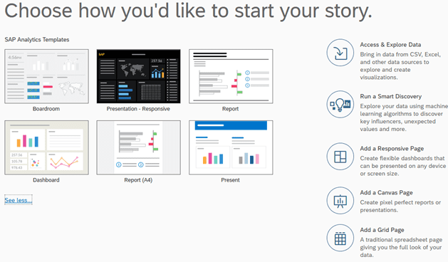
As you can see, there are many options here for customizing your story. Select “Access & Explore Data” to create a standard dashboard.
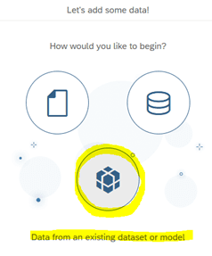
Now we choose our data source. Select “Data from an existing dataset or model”.
Select the model that you created earlier. Now you can begin customizing your dashboard.

Note: If you used variables to filter data at run-time in your calculation view, you will be prompted with the following screen:
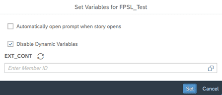
In this example, the variable created in the calculation view was used to filter for specific external contract ID’s. Because we can easily filter for external contract ID’s in SAC, we will disable the variable.
To choose a specific value to filter the data provided by the output of the calculation view, click on the icon ![]() . A drop-down list of all the available values in the column “EXT_CONT” will be displayed. Selecting one of these values will filter the data provided to the dashboard for this value only.
. A drop-down list of all the available values in the column “EXT_CONT” will be displayed. Selecting one of these values will filter the data provided to the dashboard for this value only.
Navigate to the tab “Data” next to “Story” and add all dimensions. The “Data” tab displays the raw data. In this case, the data from the underlying model.
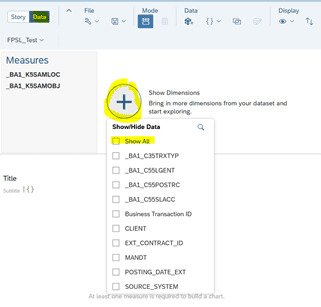

Here you can combine multiple data sources into one dashboard by clicking on the icon highlighted in yellow.

For example, you might want to combine data from FSPL with data from FSDP (you will need to create an additional connection to FSDP tenant) or you could upload a CSV file as an additional data source.
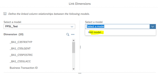
If you want to combine data into the same widget (visual chart) on your dashboard, you will need to link the dimensions between the two data models. This can be accomplished by clicking on the icon ![]() either on the “Data” tab or on the “Story” tab and selecting a second model. Both models need to have the same data type for the link between dimensions to work but the attribute name can be different. For example, EXT_CONTRACT_ID and C55CONTID have the same data type but different attribute names.
either on the “Data” tab or on the “Story” tab and selecting a second model. Both models need to have the same data type for the link between dimensions to work but the attribute name can be different. For example, EXT_CONTRACT_ID and C55CONTID have the same data type but different attribute names.
The “Story” tab allows you to create widgets in order to visualize the data from the “Data” tab. There are endless possibilities to customize the way the dashboard looks and behaves. You can add charts, tables, filters, formulas and much more.

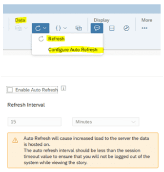
One other useful feature is the data refresh function which ensures that the data being displayed is always in real-time. To set the refresh interval, navigate to “Data” and select either “Refresh” to manually refresh the data, or “Configure Auto Refresh” to specify an interval.
Daniel Corry is a consultant in the Data Management consulting area. His areas of expertise are SAP HANA, SAP FSDM and SAP Analytics Cloud.





0 Comments